

Most pricing pages are built to segment customers. The best ones are built to sell the middle.
That sounds like a small difference. It isn't. A page built for segmentation asks: how many plans do we need so every customer type finds a perfect fit? A page built for decisions asks: what does the buyer need to see so that choosing takes one minute instead of one week?
We reviewed 52 SaaS pricing pages this month in our Pricing Lab. The same mistakes came back again and again. And almost none of them are new. Behavioral science has known the answers for decades, from supermarket jam stands to cinema popcorn. Here are five tests. Look at your own page while you read.
Test 1: Seven plans or three?
Why not one plan? Why three? Why not 24, to fit every segment's needs?
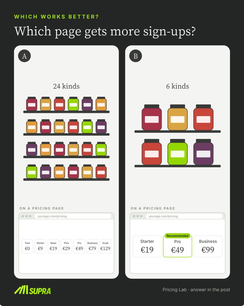
The jam shelf in the picture above is the actual study. In 2000, Sheena Iyengar and Mark Lepper set up a tasting stand in a supermarket (published in the Journal of Personality and Social Psychology). With 24 jams on display, more shoppers stopped. With 6 jams, far more of them bought: 30% of those who stopped, against 3%.
Pricing pages behave the same way. In version A, the buyer compares seven plans that differ in small steps. Many leave to "think about it". And "think about it" is where deals go to die. In version B, three plans and one clear recommendation make the decision quick.
In our review, 8 of the 52 pages asked for more comparing than a buyer will do in a minute. Six plans plus an add-on table. Thirteen price points on one page. Seven modules priced one by one.
Brands believe packages are made to segment customers. They aren't. That's why I call it the golden Good-Better-Best rule: three plans for your main buyer types, one marked as recommended, everything else on a separate page.
Test 2: Two plans or three?
Here is the twist. Too many plans hurt. Too few plans hurt too.
At the cinema you know this. With small and large popcorn, most people take small. Add a medium and the medium becomes the bestseller.
Picture a page where the buyer chooses between €29 and €99. Most take €29, because €99 feels like a big step. Now put a €59 plan in the middle and mark it "Most chosen". Suddenly €59 looks like the sensible choice, and €99 no longer looks extreme. The second page usually earns more per customer. You added a plan nobody asked for, and your average customer pays more.
Itamar Simonson showed this in 1989 (Journal of Consumer Research). When people are unsure, they lean toward the option in the middle. He called it the compromise effect: a middle option gets chosen far more often than its features alone would predict.
13 of the 52 pages we reviewed had a big jump between two plans with nothing in between. One construction app goes from $32 to $107 per user. One ERP goes from €39 to €86. The fix is cheap. Add the plan most of your customers should take, put it in the middle, and mark it.
If you have read my piece on the Enterprise Cliff, you recognise the pattern. A gap between two plans is never neutral. Customers fall into it.
Test 3: Hide the Enterprise price or show it?
Restaurants use this every day. The €180 bottle on the wine list rarely sells. But it makes the €39 Barolo look reasonable.
On a pricing page, the highest number a buyer sees becomes the top of the scale. If your top price is €99, then €99 feels like a lot. If an Enterprise plan shows €2,490 next to it, €99 suddenly looks small. Although nobody touched it.
Dan Ariely, George Loewenstein and Drazen Prelec measured how strong this is (Quarterly Journal of Economics, 2003). Students wrote down the last two digits of their social security number and then bid on products. Those with the highest digits bid three to four times as much as those with the lowest. A number with no connection to the product still moved what people were willing to pay. A visible Enterprise price does the same, and that number is at least relevant.
7 of the 52 pages we reviewed ended with "on request" or showed no price at all.
"But we want to negotiate enterprise deals." Fine. You don't need a full price list. A guide price such as "typically €2,500 a month" is enough to set the top of the scale.
And there is a second reason, a bigger one. Most B2B SaaS companies still don't have a public pricing page. In times of AI, prospects find the vendors who do. Those who don't are not even considered. The AI assistant that builds the shortlist cannot recommend a price it cannot read.
Test 4: "Save 20%" or "Save €240"?
Same offer. On a €100 monthly plan, 20% off for annual billing is €240 a year. One page shows the percentage. The other shows the money. Which gets more customers to pay annually?
Haipeng Chen, Kent Monroe and Yung-Chien Lou tested this framing (Journal of Retailing, 1998). For higher-priced products, a discount stated in money felt larger than the same discount in percent. For cheap products it was the other way round.
Most team plans count as higher-priced in this sense. A few hundred euros a year reads bigger as a number than as a percentage. Yet most pricing pages state percent. Mostly to their disadvantage.
This is the cheapest test on the list. Change one label. Measure annual uptake.
Test 5: Pay-per-use or package?
Pay-per-use looks fair. Many customers still pick the package, even when it costs them more.
It's the taxi problem. With the meter running, you watch every kilometer. With a fixed price, you just get in.
Anja Lambrecht and Bernd Skiera studied this with real internet tariff data (Journal of Marketing Research, 2006). Many customers chose a flat rate although a usage tariff would have been cheaper for them. They paid extra to stop watching the meter. And the customers who made the opposite mistake, picking the usage tariff and overpaying, were the ones more likely to cancel.
Read that twice. The "fair" model didn't just earn less. It produced churn.
On a usage page, the buyer has to estimate their minutes before they know the bill. On a package page, they see one number and an allowance that covers a normal month. One video platform we reviewed lists seven separate meters, from encoding minutes to gigabytes to player impressions, each with its own free allowance. A buyer can't predict the monthly invoice from that page. So the buyer doesn't buy.
Keep usage pricing for heavy users. Sell packages with included volume, and charge usage only above the allowance.
Why this works: your buyer isn't a spreadsheet
All five tests point at the same truth. Buyers don't compute. They don't open a spreadsheet, map their needs to 24 options and pick the optimum. They look for the option that feels safe, normal and easy to defend. The middle plan. The recommended plan. The one number that doesn't run like a taxi meter.
That is why asking customers "how many plans would you like?" gives you the wrong answer. They will tell you they want choice, flexibility and fairness. Then they buy the package in the middle. The gap between what people say and what they do is the reason conjoint misses so much in pricing, and why pricing needs causal understanding.
Five checks for your pricing page
- Plans: Are there three plans for your main buyer types, or more than a buyer can compare in a minute?
- Middle: Is one plan in the middle marked as recommended, or is there a big jump with nothing in between?
- Anchor: Does a visible top price, or at least a guide price, set the top of the scale?
- Discount frame: On a higher-priced plan, do you show the annual saving in money, not just in percent?
- Meter: Can a buyer predict the monthly invoice, or do they have to estimate usage across several meters?
These are among the checks in our 90-minute Price & Packaging Diagnostic. For the red flags beyond the page itself, read 5 red flags in your SaaS pricing, and for the broader approach see our pricing practice.
So, tell me your reason not to use Good-Better-Best. I'm reading the replies.
SaaS pricing page psychology: frequently asked questions
What is the Good-Better-Best rule in SaaS pricing?
The Good-Better-Best rule, as Dr. Frank Buckler describes it, says a pricing page should offer three plans for the main buyer types, mark one of them as recommended, and move everything else to a separate page. The page is not a segmentation tool. It is designed to sell the middle, because buyers who are unsure lean toward the middle option (the compromise effect, Simonson 1989).
Why do too many pricing plans reduce sign-ups?
Choice overload. In Iyengar and Lepper's 2000 jam study, a display of 24 jams attracted more shoppers, but only 3% of those who stopped bought, against 30% at a display of 6. Pricing pages work the same way: when buyers must compare many plans that differ in small steps, many leave to think about it. In SUPRA's review of 52 SaaS pricing pages, 8 asked for more comparing than a buyer will do in a minute.
Should a SaaS pricing page show an Enterprise price?
Usually yes, at least as a guide price such as "typically €2,500 a month". The highest number a buyer sees becomes the anchor for the scale, so a visible Enterprise price makes the mid-tier plan look smaller (anchoring, Ariely, Loewenstein and Prelec 2003). There is also a discovery effect: in times of AI, prospects find vendors with public prices, while vendors without a pricing page often are not considered at all.
Why do customers pick a flat package even when pay-per-use is cheaper?
Because the meter itself is a cost. Lambrecht and Skiera (2006) found with real internet tariff data that many customers chose a flat rate although usage pricing would have been cheaper; they paid extra to stop watching the meter. Customers who chose usage pricing and overpaid were more likely to cancel. A practical rule: sell packages with included volume and charge usage only above the allowance.
Dr. Frank Buckler advises leadership teams on growth decisions that depend on why customers choose. He founded SUPRA, holds a PhD in marketing and was among the first to apply causal AI to marketing questions. His latest book is THE TOP 5%.
