

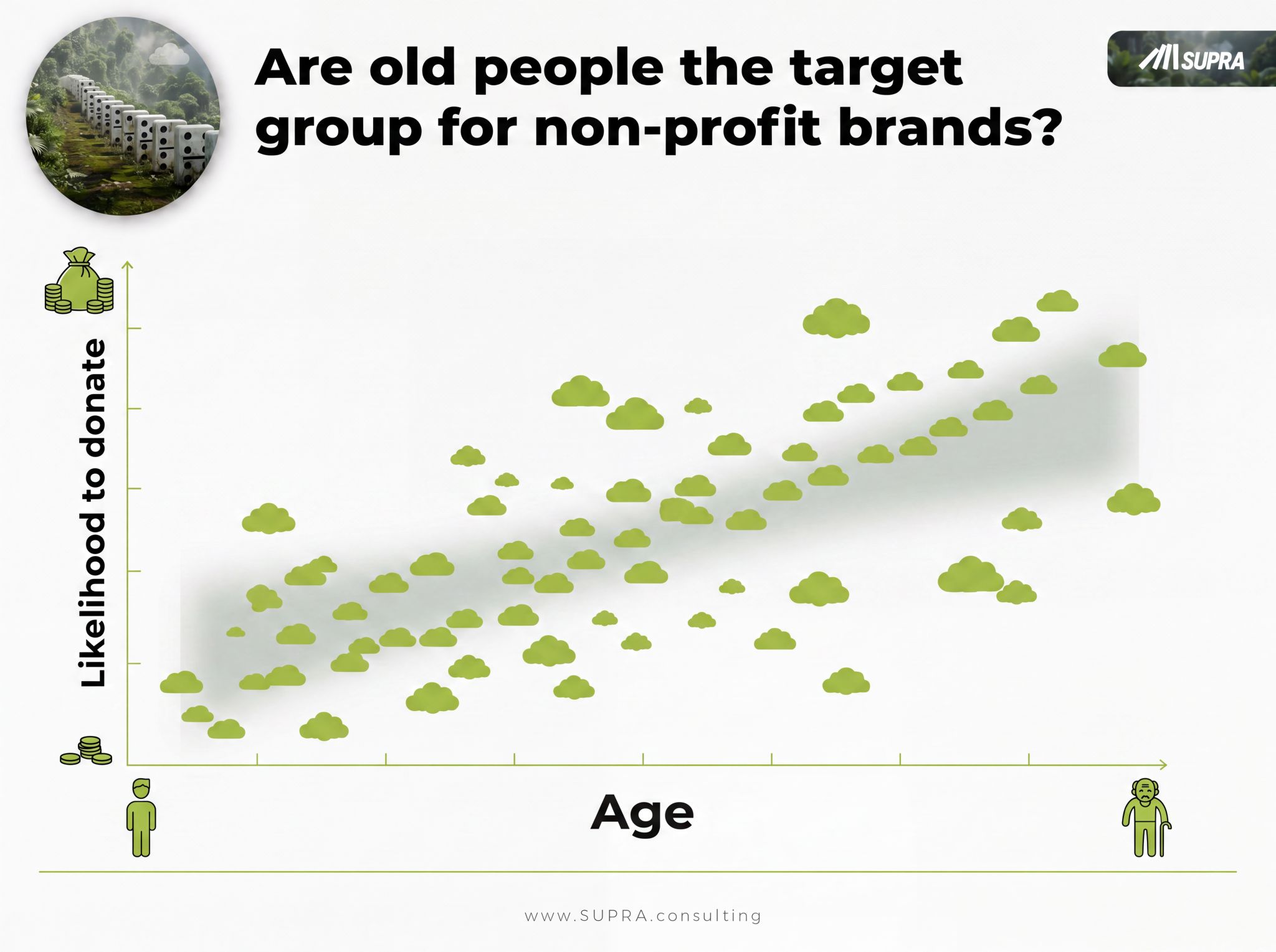
Age correlates with the likelihood to donate.
This is why non-profit brands focus on senior cohorts. Older lists, older mailings, older media. Does it make sense? Well, it works. Somehow.
But it could work much better if you understood the cause behind that correlation.
What the Correlation Is Hiding
We ran a project on exactly this, using Causal AI. The finding surprised the team.
Age has no causal impact on giving.
The real driver is personal wealth. You need some accumulated savings before you become open to donating at all. It is not income, not birth year, it is whether you have a cushion. And that relationship is nonlinear: below a certain level of savings, people are focused on their own security and give little. Once some financial safety exists, willingness to give climbs.
Now connect the two facts. The older you are, the more years you have had to save. So age correlates with giving, not because getting older makes you generous, but because getting older is how most people accumulate wealth. Age is a stand-in for the cause. A proxy. Ride the proxy and you will roughly go in the right direction. Ride the actual cause and you go straight.
The Payoff Hiding in the Correction
Here is where it stops being an academic point and starts being money.
Once you know wealth is the driver, age stops being your filter. You can now address younger affluent audiences, a group the age-based playbook systematically ignores.
And this group is not just additional volume. It is often easier to win. A younger affluent donor does not yet have a crowded set of charities in their relevant set. They are still forming their loyalties. An older donor, by contrast, knows the category inside out, already gives to three organizations, and has to be pried away from them. Convincing someone with an empty shelf is easier than replacing what is already on a full one.
So the "correction" is not a rounding error. It opens a whole audience your competitors are not even talking to, and it is the more winnable one.
Why Dashboards Seduce You Into the Wrong Move
The dashboard showed "older → more donations." Clean. Convincing. Actionable. And it pointed the whole organization at the least efficient audience.
This is the same paradox we see in commercial dashboards every single day. A correlation shows up, it looks like a lever, and the number of possible confounders behind it is large, sometimes not even in the data you have. Splitting the data by hand rarely saves you, because you cannot manually control for a factor you never measured, and you certainly cannot control for a dozen at once.
Correlation leads astray. Classical statistical models get biased by everything overlapping at once. What is needed is a method built to isolate the cause, which is the whole point of causal key driver analysis. I walked through the commercial version of this exact trap in does ad spend actually drive revenue, where spend and revenue rise together at nearly r = 0.9 and it still tells you almost nothing about lift.
How to tell a correlation is leading you astray
- The variable you are targeting is demographic and convenient (age, region, tenure) rather than a motivation.
- You can name a plausible third factor that would move both things at once, and you have not measured it.
- The relationship "works, somehow" but nobody can say why it would work if you changed it.
- When you imagine intervening on the variable directly, the causal story feels thin.
The Question Worth Asking in Your Own Data
Every category has one of these. A convenient correlation that everyone targets because the dashboard blessed it, sitting on top of a real driver nobody bothered to isolate.
For non-profits it was age hiding wealth. In pricing it is often a segment label hiding a need. In loyalty work it can be a satisfaction score hiding a customer type. The shape repeats: a proxy gets promoted to a cause, budget follows the proxy, and the real lever goes untouched.
So do not trust a causal claim just because the correlation is strong and the chart is tidy. Ask what would happen if you actually pulled the lever. If you cannot answer that, you are decorating a guess, not steering a strategy. Once you can separate the driver from its proxy, you can also target by the motivation that actually moves the decision instead of the demographic that merely rides along.
What other examples have you seen, where a correlation quietly led a whole brand astray? I am reading the replies.
Frequently asked questions
Does age cause people to donate more?
No. Age correlates with the likelihood to donate, but in a Causal AI analysis age showed no causal impact. The real driver is personal wealth. People need some accumulated savings before they become open to giving, and older people have simply had more years to save. Age is a proxy for the cause, not the cause itself.
Why is the relationship between wealth and donating nonlinear?
Because giving depends on having a cushion first. Below a certain level of savings, people focus on their own security and rarely donate, regardless of income. Once some financial safety exists, willingness to give rises. So the effect is a threshold, not a smooth line, and a model that only looks at age would miss that shape entirely.
How can non-profits reach younger donors?
By targeting younger affluent audiences instead of everyone above a certain age. Once you know wealth is the driver, age stops being the filter. Younger affluent donors are often easier to win, because they do not yet have a crowded set of charities in their consideration set, while an older donor already has established loyalties.
How do you tell a real driver from a misleading correlation?
You apply causal inference rather than reading a correlation off a dashboard. Causal key driver analysis models the whole web of factors at once and asks which one, if changed, would actually change the outcome. If a correlation collapses once the true cause is in the model, it was a proxy, not a lever. The AI Diagnostic is built to surface where this is happening in your own strategy.
Dr. Frank Buckler advises leadership teams on growth decisions that depend on why customers choose. He founded SUPRA, holds a PhD in marketing and was among the first to apply causal AI to marketing questions. His latest book is THE TOP 5%.
