

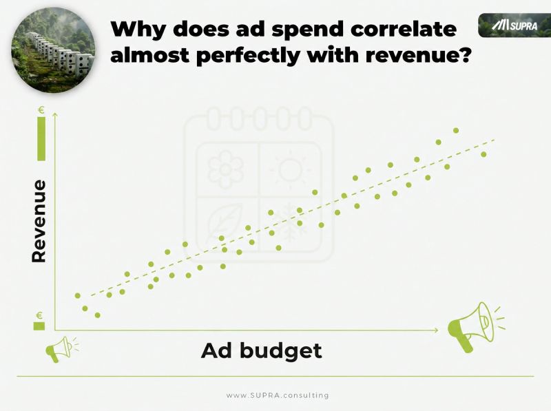
Why does ad spend correlate almost perfectly with revenue?
Overlay the two curves and they move together. In many industries the correlation runs at r ≈ 0.9, the kind of number that makes a boardroom nod. The obvious read: every euro of advertising is printing sales.
It's the most expensive misreading in marketing.
Because that near-perfect line isn't the fingerprint of great advertising. Most of the time, it's the fingerprint of something else entirely, something moving both curves at once while your dashboard takes the credit and hands it to the media plan.
Seasonality Is the Puppeteer
Here's the mechanism nobody puts on the slide.
Demand peaks at predictable moments. Year-end for retail. Spring for travel. Back-to-school, tax season, the weather turning. When demand rises, marketers do the natural thing. They pour in more budget exactly when they were going to sell anyway. Bigger flights in Q4. More spend into the moment the market was already leaning in.
So spend goes up. Revenue goes up. The two curves lock into step. And the correlation you're admiring isn't advertising driving revenue at all.
Shared timing is driving both.
This is a confounded correlation: two variables that move together because a third, hidden factor is pulling on each of them. Season is the puppeteer. Ad spend and sales are the two puppets. And the string you can't see is the one doing the work.
If this feels familiar, it should. It's the same trap I wrote about in the sunscreen paradox, a real correlation that points in exactly the wrong direction. The pattern is genuine. The story your brain writes over it is fiction.
Your Dashboard Can't Tell "Works" From "Happens at the Same Time"
Open the ROI view. Spend and sales rising in lockstep, a tidy green line, an implied return per euro. It looks like measurement. It isn't.
A dashboard reports co-movement. That's all it can do. It shows you that two things went up together, and it quietly labels that "ROI." But co-movement is not causation, and no amount of dashboard polish closes that gap. The chart literally cannot distinguish this advertising worked from this advertising happened at the same time as the peak.
That distinction is the whole game. Get it wrong and you'll congratulate the campaign that rode the wave, and cut the one that actually moved the needle in a quiet month. You'll pour next year's budget into the weeks the market gives you for free.
Attribution dashboards and last-click models don't fix this. They inherit it. Feed a confounded pattern into a prettier interface and you get a confounded answer with better typography. This is one more reason most marketing models are wrong the moment a hidden driver enters the room.
Signs your ad-spend number is confounded
- Spend and revenue track each other suspiciously well, r near 0.9 or higher.
- Your biggest "wins" all cluster in your strongest season.
- Budget is set as a percentage of expected sales, so spend rises where demand already rises.
- No model in the stack explicitly accounts for season, price, or distribution.
- When you paused spend, revenue barely flinched, but the dashboard still showed high ROI.
What Causal AI Does Differently
Correlation asks a lazy question: do these two things move together? Causal AI asks the only question that pays a budget back: if I move this one lever, what actually changes?
The difference is in what enters the model. Instead of staring at a single pairwise link, spend versus sales, Causal AI models the whole system at once. Season. Price. Advertising. Brand. Distribution. All of it, together, as variables competing to explain the same revenue.
Then it does the thing a dashboard never can: it isolates advertising's marginal effect while holding the others constant. It answers "what did the advertising add, on top of everything else that was already lifting sales?"
And here's why it works. Once season is explicitly in the model, the model can account for the year-end surge on its own terms. The spurious overlap, the part of the correlation that was really just shared timing, gets attributed to season, where it belongs. What's left over is the real lift. The number you can actually spend against.
Sometimes that number is smaller than the dashboard promised. Occasionally it's larger, hiding under a weak quarter where advertising was quietly carrying the whole thing. Either way, it's the truth, and the truth is the only input worth building a budget on. This is the same logic behind proper marketing mix modeling, done causally rather than by curve-fitting.
The Question to Bring to Your Next Budget Meeting
Don't ask "how well does our spend correlate with revenue?" You already know the answer, and the answer flatters everyone in the room.
Ask the harder one: after we account for season, price and distribution, how much revenue does a euro of advertising actually cause?
If nobody can answer that, you're not measuring advertising. You're measuring the calendar.
Correlation tells you what happened together. Causation tells you what to do next. Only one of them belongs in a budget decision.
Ad spend and revenue: frequently asked questions
Why does ad spend correlate so strongly with revenue?
Because both are pulled by the same underlying rhythm. Demand peaks at predictable times, and marketers add budget exactly when they'd have sold more anyway. Overlay the curves and they move together, often at r ≈ 0.9. The correlation is real, but shared timing is driving both, so advertising may not be driving revenue at all.
Does a high correlation between ad spend and sales prove advertising works?
No. Correlation cannot tell works from happens at the same time. A dashboard showing spend and revenue rising in lockstep is describing co-movement, not causation. If a hidden factor such as season lifts both, you'll see a strong relationship even when the incremental return is near zero.
What is a confounder in marketing measurement?
A confounder is a third variable that influences both your supposed cause and your outcome, manufacturing a relationship that looks causal but isn't. Season, price, distribution and brand momentum are common ones. Leave a confounder out of the model and its effect gets misattributed to whatever moved alongside it, usually the line you spent money on.
How does Causal AI isolate advertising's true effect?
It models the full system, season, price, advertising, brand and distribution together, and estimates advertising's marginal effect while holding the others constant. Once season is explicitly modeled, the spurious overlap it created disappears, and only the real lift remains. That remaining number is the one you can safely base budget decisions on.
Dr. Frank Buckler advises leadership teams on growth decisions that depend on why customers choose. He founded SUPRA, holds a PhD in marketing and was among the first to apply causal AI to marketing questions. His latest book is THE TOP 5%.
