

Why does churn sometimes correlate with NPS?
I have seen it with my own eyes. Twice.
The dashboard says it plainly: higher satisfaction, higher churn. Read literally, it means the happier your customers are, the faster they leave. So what is wrong? Is customer experience just nonsense in some categories? Is loyalty management a waste of budget?
No. Something is hiding in the numbers.
Case One: The Demanding Segment
In the first case, the hidden hand was customer segment.
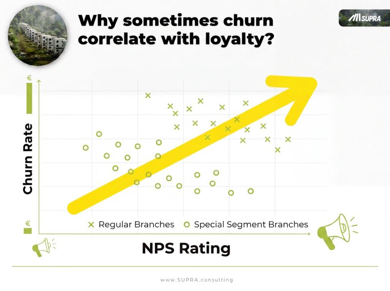
One group of customers was simply more demanding. They rated everything lower by default, tougher scorers, higher expectations, quicker to withhold a top mark. So their NPS looked weak.
But those same demanding customers bought more, and they churned less. High involvement cuts both ways: it makes people harder to please and harder to lose.
Now put both groups in one chart. The demanding segment drags average NPS down while also holding churn down, and the easy-going segment posts high NPS with ordinary churn. Blend them and the overall line points the wrong way: NPS and churn appear to move together. Split the data by segment, and inside each group the relationship flips back to what you would expect, higher satisfaction, lower churn.
The correlation was completely real. The causal reading of it was completely false.
Case Two: The Branch Effect
The second case had the same shape with a different culprit. Some branches simply ran lower churn than others, for reasons that had nothing to do with satisfaction scores, location, customer base, product mix.
Those structural differences between branches bent the aggregate relationship again. The dashboard showed "high NPS, high churn," and it seduced everyone toward a dangerous conclusion, that the CX program was backfiring, when the real story was a confounder sitting quietly underneath.
Why This Keeps Happening
A dashboard shows you what moves together. It cannot show you why. And "moves together" inverts into a false story the moment a third factor is pulling both variables at once.
This is the same paradox we see in dashboards every single day, across pricing, media, and driver analysis. A number looks like a lever. You reach for it. And the lever was attached to nothing, because a hidden factor was driving the whole picture. I walked through the ad-spend version of exactly this in does ad spend actually drive revenue, where spend and revenue rise together and it still tells you almost nothing about lift.
The lesson is blunt: do not trust a causal claim without applying proper causal inference, mostly Causal AI. A strong correlation and a clean chart are not evidence of cause. They are an invitation to check.
The Trap Inside the Obvious Fix
"Fine," you might say. "I will just split the data by segment."
Be warned. That works for one confounder you already suspected. It does not scale.
The number of possible confounders is large. Segment, branch, tenure, product, channel, acquisition source, and combinations of them. They interact. And some of them are not even in your data, a latent customer type you never recorded, a need you never measured. You cannot slice by a variable you do not have, and you cannot hold a dozen factors constant by hand at the same time. Manual splitting handles the topic descriptively, and the topic is too big to be handled descriptively.
That is precisely the gap a causal method fills. It accounts for many confounders at once, can infer some it cannot see directly, and estimates what would actually change churn if you intervened, rather than what merely coincides with it. That is the difference between a real driver of churn and a number that happens to move alongside it. It is also why tracking that predicts behavior beats tracking that just describes it.
Signs your NPS or churn dashboard is lying to you
- A relationship points the "wrong" way, and the room starts inventing exotic explanations for it.
- The result inverts when you split by an obvious segment, and nobody asks what other splits would do.
- The metric is an average pooled across very different customer types, branches, or products.
- You are about to cut a program because a correlation, not an experiment, told you it wasn't working.
Before You Act on the Chart
The demanding customers were the most valuable ones in that business. Read the raw dashboard literally, and you would have "fixed" your best segment straight out the door.
So when a loyalty number surprises you, resist the clean conclusion. Ask what type of customer, what branch, what unmeasured need is sitting behind the line. A correlation that flips under one segment split will usually flip again under the next one you have not tried.
Are you still correlating, or already explaining? I am reading the replies.
Frequently asked questions
Can NPS really correlate positively with churn?
Yes, in the raw numbers it can, with higher NPS lining up with higher churn. It does not mean satisfaction causes people to leave. It means a third factor drives both. In one case a demanding segment rated everything lower yet bought more and churned less, so pooling the segments made the overall relationship point the wrong way. The correlation was real; the causal reading was false.
What is a confounder in a CX or churn analysis?
A confounder is a hidden factor that influences both what you measured and the outcome you care about, creating a correlation that is not causal. In loyalty data, customer segment, branch, tenure, or product mix can all act as confounders. Demanding customers, for example, push NPS down and churn down at once, so segment quietly bends the NPS-churn relationship.
Why doesn't splitting the data by segment fully solve it?
Splitting by one segment can flip a single relationship back to the truth, but it does not scale. The number of possible confounders is large, they interact, and some are not even in your data. You cannot slice by a factor you never recorded, or hold a dozen factors constant by hand. That is why descriptive splitting breaks and a causal method is needed.
How do you find the real drivers of churn?
You use causal inference, mostly Causal AI, instead of reading correlations off a dashboard. A causal model accounts for many confounders at once, including some it can infer rather than see directly, and estimates what would actually change churn if you intervened. That turns a loyalty dashboard from a rear-view mirror into levers you can trust. The AI Diagnostic is a fast way to see where yours are misfiring.
Dr. Frank Buckler advises leadership teams on growth decisions that depend on why customers choose. He founded SUPRA, holds a PhD in marketing and was among the first to apply causal AI to marketing questions. His latest book is THE TOP 5%.
